Designer Brand Logo/Design a Business Card
Company Logos
Here is a quick example of a lovely design. This above is a PlayStation logo design, at a first glance this logo might look like a bunch of squiggles that are quite recognisable but What it actually is is a P in front of an S that is lying down behind it which is very good for remembering that the company name is PlayStation. The colour they use is blue, Blue is commonly associated with being the worlds favourite colour is it is the colour of the sky and of water, this means that whoever sees this logo will most likely like the colour that is behind it and investigate further to find out that this is the logo for the games console PlayStation. My Logo Designs
When creating a logo I wanted to invoke the idea that this is a company that would create films and produce films and I wanted the idea of it to be catching to the eye. I believe with this first draft that are invokes The same sort of response you get from seeing in marvel studios production when it comes to the font and the way the background looks and looks very professional. But I felt that this wasn’t good enough and eye catching enough as the main colour scheme is Black white and purple and pink which is very nice looking design but also isn’t very eye-catching and doesn’t much provoke the idea that it is a film company that you are looking at.
Put the second go I changed the colour of the logo and the name of the studio to the colour of red as it is commonly known as a colour that is very eye-catching and better than purple. I also change the front of the word exceptional which does look nice but also makes it look more bloated and cartoony to me. I also change the logo to a very simplified version of the infinity logo which is good for understanding what the logo was meant to be but also isn’t very memorable as it is very simple and could be mistaken for any other infinity logo.

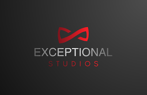
This logo that I created seems to be the best combination of all of the logos that I made before it as the emblem logo has a distinct enough lock but also links to the idea of infinity which I do like. The fonts used in this version stand out bud don’t overstayed our welcome as something that could be miss read and the colour red is perfect for this Alice what I said before as red as a very commonly used colour to direct the eyes and catch peoples gaze.
Business Cards
The business card above is the first try at making a business card for my company exceptional studios. This card is serviceable but looks very unprofessional due to the clashing of colours and ideas. But a lot of the information I had put on this Version of my business card was very serviceable and nice and readable. There is no mistaking what I do for a living on this business card and how you can contact me for work in the future.
This is the new improved version of the previous Business card, of course they are very similar as they still have the same font and everything the only major change being that it is no longer black on the right side making the colours less clashing overall but I did still keep everything in the right place because I feel I did nothing but struck gold with Halle easy and accessible and readable everything is on the previous version of the business card.


Comments
Post a Comment